
Misinformation about "Misinformed" Voters
All four questions in this infographic are carefully framed to get incorrect responses.

I’ve seen this infographic make the rounds on the Internet after the 2024 United States general election. People have been citing it in attempts to attribute Donald Trump’s winning of the popular vote for President of the United States over Kamala Harris to “misinformation.” (The infographic actually comes from an article on Ipsos that was published before the election.)
However, if you look into the questions, they are framed in such a misleading way that the message of the infographic that “misinformed people vote for Trump” is itself misinformation.
This infographic is reminiscent of the subject of the classic book How to Lie with Statistics by Darrell Huff.1 It is an example of how you can get statistics to say whatever you want by carefully framing them in certain ways.
Most respondents got the questions wrong. An earlier infographic in the same Ipsos article reveals that only about 30% of respondents answered the crime rate, inflation, and border crossing questions correctly. About 45% of respondents answered the stock market question correctly.
The questions are constructed in such a way to have an answer that is technically correct, but also to entirely miss the point. This probably tripped up a lot of respondents.
As Scott Alexander has observed,
…people – including the very worst perpetrators of misinformation – very rarely say false facts. Instead, they say true things without enough context.
Let’s look more closely at the context for these questions.
“The U.S. stock market is at or near all-time highs (True)”
The U.S. stock market has grown exponentially. Below is the historical average price of Standard & Poor’s 500 (S&P 500).

It has grown 22,190% just since 1950.
Given the vagueness of “near all-time highs,” the U.S. stock market can “correctly” be said to be “near all-time highs” always.
Note that the y-axis of the above plot is on a logarithmic scale. Here is the same plot on a linear scale.

You can’t even see the Great Depression of 1929 without using a logarithmic scale.
The fact that the U.S. stock market is “near all-time highs” is just trivia. Population size has increased. Inflation has happened. The numbers keep getting bigger.
Given this context, we can see just how condescending it is to include this question in a survey of potential voters. This is a question that sheds no light on how the economy is doing. It might, however, trip up some working-class voters who didn’t go to college, didn’t see plots like this in economics class, and who are struggling to make ends meet because of the recent spike in inflation.
“Inflation in the U.S. has declined in the last year and is near historic averages (True)”
This summary on how we measure inflation from the Bookings Institution tells us,
Inflation refers to changes over time in the overall level of prices of goods and services throughout the economy.
The important context here is that inflation is the change in prices.
There are two major instruments used to measure prices in the United States: the Personal Consumption Expenditures (PCE) Price Index and the Consumer Price Index for All Urban Consumers (CPI-U).
Expenses can fluctuate with the time of year. For instance, households pay more for gas utilities in the winter than they do in the summer. Because these seasonal variations cause spending to increase or decrease throughout the year, they can make inflation seem more or less than it actually is.
Therefore, I downloaded the seasonally adjusted versions of the PCE and CPI-U for 1947 to 2024 and used these data sets to create the plots in this section.
Below is a plot summarizing the change in PCE from quarter to quarter.
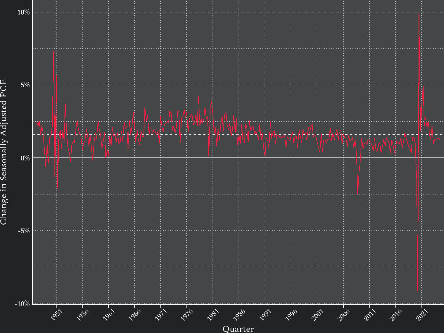
The dashed horizontal line in the plot is the average change in PCE during this time frame.
The PCE was volatile as the economy settled down after World War II. The 1970s was a period of sustained above-average inflation, but it generally trended down after that. The twenty-first century had less inflation than in the preceding decades.
There was a large decrease in the PCE followed by a corresponding increase during the 2020 COVID-19 pandemic. After this, there was uninterrupted above-average inflation between Q3 2020 to Q2 2022. This was followed by below-average inflation thereafter with the exception of above-average inflation in Q1 2023.
A similar plot for the CPI-U confirms these trends but has more noise because the data are by month instead of by quarter.

According to the monthly CPI-U, there was uninterrupted above-average inflation from February 2021 to June 2022, then a period between July 2022 and April 2024 in which inflation fluctuated between above- and below-average, then uninterrupted below-average inflation from May 2024 to October 2024.
It is therefore true that inflation has “declined in the past year.” It declined after spiking to levels of inflation that rival the previous peak in inflation during the 1970s (though for a less sustained period of time).
It is also true that inflation is now “near historic averages.” But remember that inflation is the change in prices. Prices have already increased abnormally. Now that inflation is back to normal rates, prices don’t go back down. They continue to increase. They just increase at a normal rate.
Here is a plot of the raw PCE to illustrate this.

The shaded area represents the period in which the PCE increased at above-average rates.
The line keeps going up, but in the shaded region, the line goes up faster than normal. After the shaded region, the line goes up at about the same rate it was going up before the shaded region.
This can be seen with the CPI-U, too.

To put this in perspective, the PCE was 14,478 in Q3 2020. At the end of Q2 2022 when inflation rates returned to normal, it was 17,876. This is about a 23% increase in two years. With some back-of-the-envelope math, if a household were spending $2,500 per month in Q3 2020, it would be spending about $3,087 per month in Q2 2022 for the same things.
After inflation returned to normal, prices continued to increase. By Q4 2024, the same household would be spending $3,441 per month for the same things.
This is what Americans are reacting to when they complain about inflation. We can assume most Americans don’t watch the PCE and the CPI-U religiously. They do notice when they pay $2,500, then two years later pay $3,087, then two years later pay $3,441 for the same things.
Can you tell just from the prices alone which of those two-year periods had above-average inflation and which had normal inflation? Americans can similarly be forgiven for answering this question incorrectly.
The question itself is incorrect in a more profound way than any of its answers. Regardless of whether or not inflation has returned to historical norms, the spike in inflation did happen, prices did rise abnormally fast, and prices continue to be higher than expected.
What makes the question itself incorrect is the attitude behind it. It ignores what actually is affecting the economic welfare of Americans in favor of manufacturing a self-congratulatory statistic for a pointless infographic about “misinformed” voters.
“Over the last few months, unauthorized border crossings at the U.S.-Mexico border are at or near the lowest level in the last few years (True)”
I am not going to try to evaluate the substance of this proposition. We don’t really know the number of unauthorized border crossings there are. This is something that you have to build a model in an attempt to estimate. There is probably enough material to do a PhD dissertation on this subject, and I am not going to invest the time it would take to endorse specific estimates.
I will make two points, however.
First, this suffers from the same issue as the inflation question. Even if the number of unauthorized border crossings has returned to normal levels, the spike in unauthorized border crossings over the past few years of the Biden-Harris administration has already happened. Just like how the spike in inflation followed by normal inflation leaves prices at an elevated level, the spike in illegal crossings followed by a normal number of illegal crossings leaves the number of migrants illegally in the United States at an elevated level.
Second, the language in this question is so vague that you can interpret it however you want to make whatever answer you want to be “correct.” Exactly how many months are the “last few” months? Exactly how many years are the “last few” years? Exactly how low does the level of unauthorized border crossings have to be in order to be “near” the lowest level? There are no less than three variables you can shift around to get whatever result you want.
“Violent crime rates are at or near all-time highs in most major American cities (False)”
Looking into this, I found that crime statistics in the United States need improvement.
There are two major sources for nationwide crime statistics: the Uniform Crime Reporting (UCR) of the Federal Bureau of Investigation and the National Crime Victimization Survey (NCVS) of the Bureau of Justice Statistics.
The UCR collects crime records from the 18,000 or so police agencies in the United States and aggregates them into nationwide counts. The NCVS surveys about 150,000 households in the United States about whether or not household members have been the victim of a crime.
One issue is that a minority of crimes are even reported to the authorities in the first place. The NCVS has found that over the past 30 years, only about 40% to 50% of violent crimes have been reported to the authorities. We therefore expect the UCR to have lower estimates of violent crime than the NCVS.
However, even taking this into account, the UCR consistently reports less violent crime than even the NCVS estimates of just the violent crime reported to the authorities. Something is not adding up. Likely, some crimes reported to the police do not get processed.
Furthermore, if you look at the UCR’s crime totals over the years, you will notice a spike in the number of reported violent crimes in December of each year, more than double the number of crimes reported in any other month. It is unlikely there is a sudden crime spree every December of this magnitude. Instead, this is likely an artifact of agencies catching up on crime reporting for the year.2
Below is a plot of both UCR and NCVS counts3 of violent crime in the United States.

There is an “X” in 2006 for the NCVS and in 2021 for the UCR because of issues with the data from those years. These points should not be used for comparison with other years.
The shaded band around the NCVS estimates represents a 95% confidence interval. These intervals are given because the NVCS is a probability-based survey with some amount of sampling error.
The most glaring thing in this plot is that the UCR’s counts of violent crimes tend to stay around 4 million per year, whereas the NCVS’ estimates of violent crimes change dramatically.
Furthermore, either the UCR is vastly underestimating the number of violent crimes in the 1990s, or the NCVS is vastly overestimating the number of violent crimes in the 1990s.
I tend to believe the NCVS’s estimates are closer to reality. The UCR likely measures how many crimes police agencies are able and willing to process, rather than the number of crimes actually committed. This measure of police throughput appears to be relatively stable compared to the number of crimes that are occurring each year.
Indeed, after looking into this, I wonder why people fret so much about the UCR statistics at all. Other than for criminal homicides,4 the UCR statistics don’t seem to tell us much.
Based on the NCVS estimates, it is technically true that violent crime is not “at or near all-time highs” because violent crime was much higher in the 1990s than at any point in the twenty-first century.
However, this is another example of a question seemingly designed to trip people up. The violent crime rate is up. It increased in 2022 and 2023 over what it was in 2020 and 2021. Current levels of violent crime are as high as they have ever been in the twenty-first century.
Most people do not keep track of the NCVS. Many people do have a correct perception that violent crime is increasing in their communities. By framing the question as referring specifically to “all-time,” the survey has managed to nudge respondents’ intuitions into incorrect answers. If you simply changed “all-time highs” to “highs of the past thirty years,” then it would switch which answer is correct.
Conclusion
The fact that some people enjoy infographics such as these is indicative of a larger problem with American politics. Some would rather spend time manipulating statistics to show how much smarter they are, rather than use statistics to learn about the issues that concern their fellow Americans. Some would rather be “right” in their own heads than think about their neighbors with compassion.
In this specific case, it is the constituency that just lost a presidential election that is engaging in the frivolous exercise. Because American politics is dominated by two minority parties, the pendulum will probably soon swing the other way, and the opposite political party will suffer an election defeat. As long as both parties fail to learn from their defeats, this pendulum will keep swinging back and forth.
You could take an electoral loss as a cue to take seriously the substantive points of disagreement voters have with your platform, revise it, and build a broader coalition for the next election. Either party could do this and become a majority party. Attributing electoral losses to “fake news” or “misinformation” – or denying that they are electoral losses at all – robs you of this opportunity.
Incidentally, Darrell Huff himself would go on to lie with statistics on behalf of tobacco companies.
The UCR should do a better job of discussing these issues on its website.
The question from the Ipsos infographic specifically refers to violent crime rate, not counts of violent crimes. However, the crime rates between the UCR and the NCVS are not directly comparable because the target populations are different. In particular, the NCVS only asks whether people over 12 years of age have been the victim of a violent crime. The UCR should include violent crimes committed against people 12 years and younger. Therefore, the denominators in the rate calculations differ between the NCVS and the UCR.
Unlike other, less severe crimes, criminal homicides tend to be reported to the authorities and investigated by police. Furthermore, homicide victims cannot respond to a survey. Therefore, criminal homicide is the one case in which I would trust the UCR’s numbers over the NCVS’s estimates.
Thanks for this analysis. Perhaps infographics are the statistical equivalent of a soundbite. Whenever I see a government, statistic, I recall the Last Poets asking "Related to what?"
As confidence in police decreases, the rate of crime reporting is likely to decrease in correlation. Since crime recording is a relatively recent practice, I would rather hear 'since records began' than 'all time'.
One really easy way to lower the crime statistics is to decriminalise loads of activities that used to be counted.